Why Purpose-Led Branding in India Is Winning Consumer Trust in 2026
Why Purpose-Led Branding in India Is Winning Consumer Trust in 2026 Purpose-led branding in India is winning trust because Indian...
Read More → 
THE BEST MARKETING CONSULTANT IN DELHI
Brand Identity consistency comes from one small written system: a logo with usage rules, two or three colors, two typefaces, a photo style and a tone of voice. You then apply that system the same way everywhere a customer meets you. Instagram, your website and your packaging should each adapt the system to their format. None of them should reinvent it.
Most brands don’t set out to look inconsistent. It happens in small steps. A designer makes the Instagram templates, a freelancer builds the website a year later, and a printer produces the boxes from a file someone found in a WhatsApp chat. Each piece looks fine alone. Put them on one table and the orange is three different oranges.
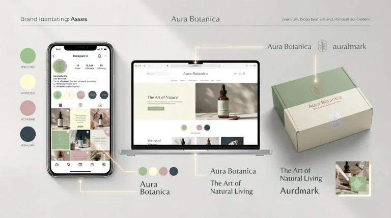
The cause is almost always missing documentation. The brand lives in one person’s head, or in a single Canva file nobody else can find. When a new person touches the brand, they guess.
Customers rarely notice a mismatch consciously. They just feel less sure. If the shop on Instagram looks sharp and the checkout page looks like a different company, buyers hesitate, and that hesitation is hard to trace back to a font choice.
A brand style guide doesn’t need forty pages. For most small and growing brands, one clear document covering these points is enough:
That list is the backbone of every brand touchpoint you’ll build. When someone asks what the button color is, the answer is in one place.
Instagram is where your identity gets tested most often, because you post constantly and often in a hurry.
Build a small set of post and story templates instead of designing each one from scratch. Three or four layouts are enough: a product shot, a quote or tip card, an announcement, and a carousel cover. Lock the fonts and colors inside them so anyone on the team can post without drifting.
A few practical details matter here:
A website exposes inconsistency faster than any other channel because there are so many small elements: buttons, forms, error messages, footers, product pages. Take your style guide and turn it into a short list of fixed decisions:
Heavy custom fonts also slow pages down, so choose weights deliberately. If you pick a typeface for the brand and it makes mobile pages crawl, the design hasn’t actually worked. This is especially true for ecommerce stores, where load time affects whether someone reaches checkout.
This is the touchpoint where most brands get surprised. Screens mix light (RGB). Print uses ink (CMYK or spot colors). A vivid teal on your website can print noticeably duller on a box, and nobody has done anything wrong.
To avoid that:
Unboxing is a brand moment. A customer who saw your Instagram, bought from your website and opened the box should feel one continuous experience.
Element | Website | Packaging | |
Logo | Square or circle version | Horizontal version in header | Primary or one-color version |
Color | HEX, screen | HEX, screen | CMYK/Pantone, proofed |
Typography | Template-locked fonts | Web-optimized fonts | Print-ready, outlined fonts |
Imagery | Consistent feed style | Same photo standards | Same photo and illustration style |
Voice | Short, conversational | Clear, task-focused | Minimal, on-brand lines |
Collect everything customers can see: your Instagram profile and last twelve posts, your homepage, a product page, your packaging, an invoice, an email. Put them side by side, on screen or printed.
Then check them against the list: is the logo consistent, are the colors the same, are fonts matching, does the photography feel like one shoot? Mark every mismatch. Fix the highest-visibility ones first, usually the logo version and the primary color.
Faster tools can help once the rules exist. AI design tools can speed up template variations and mockups, but they only produce consistent results when you feed them a clear style guide. I covered which ones are worth using in the AI design tools blog. Without a system behind them, those tools just produce inconsistency more quickly.
If your brand has grown past one person’s memory, a consultant can make the system for you. Typical signs are multiple people posting, a website redesign coming up, new packaging being planned, or a growing sense that the brand looks different everywhere. The work is mostly defining decisions and writing them down. You can read how that process works on the branding consultant in Delhi page.
If you run a brand in Delhi or sell online and want an honest look at where yours is inconsistent, Ritwik Sachdeva offers a straightforward conversation about your current touchpoints. You can reach out at 9289626386 or through the website.
It’s a brand that looks, sounds and feels the same wherever a customer meets it. The same logo rules, colors, fonts, imagery and tone appear on Instagram, your website, your packaging and everything else.
A short one is enough for most small and growing brands. If it covers logo use, color values for screen and print, typography, photo style and voice, it will prevent most inconsistency. You can always expand it later.
Screens create color with light (RGB), while print uses ink (CMYK or Pantone), so the same shade can look duller on a box. Give your printer CMYK or Pantone values from your style guide, and approve a physical proof before the full print run.
Usually two typefaces and a palette of two or three main colors plus a neutral. More than that makes consistency harder for anyone who touches the brand later.
Yes, but only the tone should flex. The logo, colors, photo style and core personality should stay the same, so customers recognize you on both.
Start with the ones customers see most often: your Instagram profile and recent posts, your homepage and product pages, and your packaging. Then move on to invoices, packing slips, email footers and WhatsApp business profiles.
Give them the style guide plus ready-made templates, so they’re working inside the system instead of interpreting it. Lock fonts and colors inside the template files, and keep a single shared folder with the approved logo files.
Yes, as long as the versions are defined in advance. A square or circular version for Instagram and a horizontal version for the website header is normal. Problems start when people create their own versions on the fly.
Update them whenever the brand changes in a real way, such as a new product line, a packaging redesign or a logo refresh. If nothing has changed, a quick review once a year is enough to catch anything that has drifted.
It makes sense when several people are creating content, a website redesign or new packaging is coming up, or your brand looks different on every platform and you can’t pinpoint why. A consultant defines the decisions and writes them down, so your team can follow them without guessing.